Building transparent and trusted supplier payments for Indian SME businesses
Problem: SME buyers couldn't understand their supplier payment status, transaction details, repayments, and rising support volume. Approach: Reframed the product around the user's mental model (ex: invoice-centric, not account-centric) to build
clarity at every high-stakes moment.
Impact: 90% drop in support queries · 18% credit utilisation lift · $3M+ profit generated
Team: 1 PD · 1 PE · 1 FE · 1 BE
My role: Solo designer; end-to-end


UdaanCapital advances supplier payments for Indian SME businesses through invoice financing. How: a buyer uploads an invoice, the platform pays the supplier, and the buyer repays over time. The users are small business owners running on tight margins, tight timelines, and supplier trust built over years.

Priyan sells batteries in Mumbai. Diwali season. ₹20 lakh order. Supplier waiting.
He uploaded the invoice on a Tuesday and expected funds by Friday. Friday came and went silence. Monday: ₹18 lakhs arrived. No explanation for the missing ₹2 lakhs. No timeline. No status anywhere. He called support. By the time it was resolved, he'd missed the deadline and damaged a supplier relationship built over years.
The invoice was verified. The disbursal was accurate. The system was functioning exactly as designed. But the user was panicking. There is a gap between a system that works and a user who can't tell.
What the data said
High support volume around disbursal and repayment
▶ Increasing operational costs and overwhelming the support team. The most common queries: 'Where is my money?' and 'Why was this amount deducted?

Low credit limit utilisations
▶ Crores of unutilised funds: Users weren't drawing down available credit

Increasing delayed repayments
▶ Users missing due dates
What observed,
-
The problem wasn’t missing features; it was missing clarity.
-
Users were trying to answer basic questions like:
-
How much can I use?
-
Where is my money? How is it calculated?
-
What happens next? how to settle?
-
-
The system had all the answers, but not in a way users could access or trust


"I called support because I couldn't find the information anywhere in the app"
: Majeed, Mobile retailer

"I prefer not to call support for every detail. Please make sure all the relevant information is easily available in the app." :
Ashok, Material supplier
WHERE THE CURRENT EXPERIENCE WAS FAILING


Information is fragments. Users had to open three or four screens to understand one transaction. Status arrived without explanation. Charges appeared without calculation. Due dates existed. just not where or when a user needed them. When no answer was findable in the app, there was one option: call support.
Information existed. Understanding didn't.
Insight 01.
It wasn't a usability problem. It was a structural one.
Users weren't confused about how to use the app. They were asking questions the app wasn't designed to answer. During sessions,when testing ledger some users pulled out their phones and manually mapped Ledger entries against their accounting sheet.
The question they kept asking was, "Which invoice is this charge for?" The app had no direct answer because the system wasn't organised around invoices.
A bank account organises money by time, credits and debits in a line. But SME financing users organise their financial world by invoice. Every ₹1 they're owed, every ₹1 deducted, every due date, all anchored to specific orders with specific suppliers. The system spoke the wrong language.
The system was account-centric. The users were invoice-centric. this was the root cause of everything.
Insight 02 and 03
The product never explained itself
At every moment of confusion like a delayed disbursal, an unexpected deduction, or a due date. the app was silent. It delivered outcomes without explaining them. There was no escape path and clarity inside the product, so users had one option: call support. The app had no voice of its own.
Users had already given up on the app
Users had built a parallel system outside the app, SMS, WhatsApp, Excel sheets. They'd given up on the product as a source of truth.. That's broken trust.
Old probelm framing
"Users don't understand our product features."
New framing
"The system's logic doesn't match how users think about payments."
It wasn't a surface-level usability fix; it was a mental model misalignment between how the user needs the payment to work and how the system works. That reframe changed everything. The solution wasn't more features. it was rebuilding the product's structure around the mental model users already had
DESIGN SOLUTIONS
Each solution addresses a different moment where the product was failing the user, structurally, communicatively, or in terms of trust. Together they close the gap Priyan fell into. Each one is an expression of the same fix: organise around the invoice, not the account.


01. Homepage as foundation of clarity
Why: The homepage is the first signal of whether the app could be trusted. If a buyer couldn't immediately see their available credit or find where to pay a supplier. They started every session from uncertainty, and that uncertainty is what drove them to support before they'd even tried anything.
What we changed: available credit moved to the top — not for visual hierarchy, but because it's the one number that determines whether any other action is worth taking.
Everything else follows in the order buyers actually think, not the order the system preferred. (How much credit do I have left? How do I pay my supplier? What's the status of my last invoice? What are my upcoming charges?)
We received the highest number of queries, and in the test, users had the least clarity on...
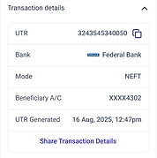
02. Disbursal visibility at the highest-stakes moment
Why: Once a user uploaded an invoice, the app went silent. No status, no timeline, no explanation when money arrived short or late. They checked SMS, opened the app, found nothing, called support. Disbursal was the most critical moment in the product and it had no design attention.
How We broke disbursal into three stages, each with a clear status.
- Invoice verification tells the user their invoice is being reviewed and sets a timeline.
- Pre-disbursal is where most delays actually happen; funds often come from an external lender, something we had never communicated. After legal checks, we chose to name the lender. Why,If the app was going to earn trust, it had to stop staying silent about things that affected users.
- Post-disbursal shows the full breakdown; the final amount is never a surprise.


Giving the users the power to disburse their remaining partial disbursal funds. (The second disbursal of the invoice doesn't require verification, making the process faster). This increased the user's limit utilization by ~5%
CONFLICT STORY
As we are introducing the 'cancel' process, should we show our interest charge up front? Doesn't it make the user inclined to think about cancelling?
My take: If a user withdrew after seeing the rate, that was an informed decision. If they completed it without understanding the charge and felt surprised later, it would be a concern and a loss of trust. Hiding uncomfortable information is a short-term conversion gain and a long-term trust failure.
Supporting data: Confusion about charges was already creating a good number of tickets.
Outcome: No spike in withdrawals. Charge-related support queries dropped


03. Transaction: Following the user-model, not the convention
Why: The ledger was a monthly list of amounts with no context, no reference, and no explanation of what each entry meant. Users couldn't connect a payment to that request. When they couldn't find the answer in the app, they tracked it themselves, in SMS, in WhatsApp, and in Excel sheets.
Iteration 01
The process began with a hypothesis: “A simple ledger of credits and debits, Inspired from a typical bank's statement!, that would make the experience familiar and easy to use (Jakob’s law of internet user experience)”

It felt standard! Proven! But what happened in testing? it didn't worked the way we expected. Instead, they are asking

💡 That's not a UI fix, it's a structural difference in how these users organise their financial world. Rebuilt the entire flow around the invoice.
“Which invoice is this interest for? Why was this amount taken? Is this linked to my last disbursal?” Some showed how they manually map items to invoices.
Iteration 02


Invoice-wise narrative: Each invoice reveals its entire financial "story": principle, discounts, interest, and repayments.
What if we show how repayment will settle even before they make a payment?
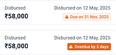
04. Repayment: Removing the anxiety before the action
Why: Repayment delays were rising. The app showed a due amount and a repay button; there was nothing about how payment is settled or what would happen after they paid.
Our hypothesis: the problem wasn't willingness; it was uncertainty about what paying would actually do.
How: Invoices settle in order of due date, a logic that existed in the system but was invisible to users. Rather than documenting it, we designed the screen to show it.
Enter any amount, and the breakdown updates live: which invoices will settle, what's left, how interest is reduced. Users learn the settlement logic by using the tool, not by reading about it.
Me and Jash (Back-end engineer) One-day experimental project
-
Started with paper sketches -> basic design -> built-in code ---------------------->
After launching with a small group: Feedback was positive, users understood the tool, and we earned buy-in from the business


Queries related to repayment dropped by ~85%
The 'Repay remaining' aimed for that small amount remains to settle one invoice completely.


CONFLICT STORY
As this page has playfulness as a mood, should we use a slider to change the amount? When first tested internally, comments were, 'I can't land on the exact number I want.' Still, we went ahead with the release of both the slider and typing. Metrics showed users were not interested in the slider.
FAILED EXPERIMENT! : Date-wise dues view
Hypothesis: Users could see invoice-level repayment details in the above view. What if we also show a date-wise summary of dues? This might help users anticipate payments, plan cash flow, and pay on time.
We assumed users would easily understand.
▶ Interest is calculated daily, so amounts change daily ▶ Early/partial payments: the remaining outstanding will change
Fix

Released to a small group; Confusions appeared immediately. Users began asking:
🙆🏻 Why is the amount different today?
🙆🏻 Yesterday it showed different
🙆🏻 How do I have that much due?

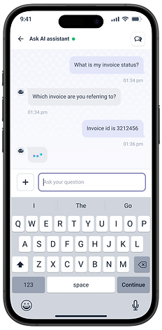
Ask AI assistant. When users get stuck mid-task, a specific charge, an unfamiliar term, or a status they don't recognise, there's now a place to ask.
50% of recommended questions in english
other 50% is regionally language written in english (postcode-based).


LEARNINGS
Business & design: In highly competitive fintech markets, design must start with policy-level decisions. A superior user experience is the foundation of great product value
Different projects required different processes
Intuition-driven: Home page, Suspension...
Solution-driven: Repayment screen...
Research-driven: Invoice details, ledger... Continuous iteration and feedback served as the ultimate wrap-up for every process
Collaboration: Better sync and collaboration between team members directly correlates with faster product iterations and more efficient execution, and the design function have to be positioned to represent how the user thinks and works.
Attention to details: Attention to small details in design is crucial. These details contribute to a stronger, more coherent design system and maintain quality, especially when the product scales
WHAT I'D DO DIFFERENTLY
Document the research more rigorously. Spend more time understanding the users' business stories and use cases better to identify opportunities.
I could have mapped the entire ecosystem in the early months, rather than understanding how people and businesses work through multiple projects.
Initial day’s design system

How it has evolved today


Priyan now knows exactly what to do to get his supplier paid on time,
In fintech, trust isn't built through features.
It's built through clarity at the moments that matter most